
Transforming RPM Studio Into a Modern, High-Performing Music School Website
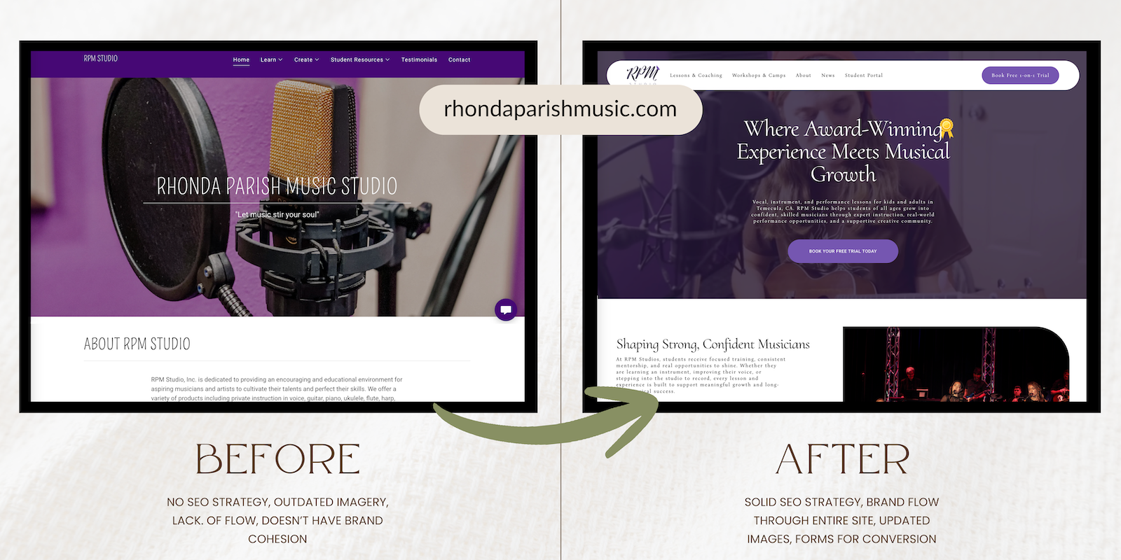
As a Northern Nevada based brand and web designer, I love taking on projects that blend strategy with storytelling. When Rhonda Parish reached out about elevating RPM Studio, she wanted a music studio website that finally matched the professionalism, heart, and history of her Temecula based program. This project became a full transformation that touched everything from the visual identity to the user experience. It quickly became one of my favorite examples of thoughtful music studio branding.
Here is a full look inside the process.
Step 1: Understanding the Heart of the Studio
Every great brand starts with clarity. RPM Studio already had a strong mission, a long standing reputation, and students who perform at incredible local venues. My goal was to translate all of that into a modern, emotional, and highly functional music studio website.
During the strategy phase, we clarified:
The brand identity centered on the message Let Music Stir Your Soul
The teaching philosophy that blends technique, confidence building, and real performance experience
The need for a more polished brand that reflects 20+ years of teaching
A desire for visuals that feel elegant, expressive, and inviting for both parents and students
This step set the tone for everything that followed.

Step 2: A Fresh Approach to Music Studio Branding
RPM Studio needed a visual identity that captured artistry and warmth. The original brand leaned heavily into purple, so we intentionally kept it as a recognizable thread while elevating the palette into something more modern and timeless.
What We Updated:
Color Palette: A refined jewel toned direction that keeps the recognizable purple while feeling elevated and studio quality. This created a polished purple website that stands out in the music education space.
Typography: Custom, clean typography that gives an elevated, yet unique brand feel.
Logo and Submark: A more refined approach to bird branding that symbolizes freedom, artistry, and the emotional side of performance.
Visual Style: Minimal lines, pill shaped accents, and airy sections that feel both creative and structured.
Together these elements created a brand that finally reflects the professional level of the studio.
Step 3: Rebuilding the Music Studio Website for Modern Students and Parents
The website needed to feel alive. A music studio is a place of motion and sound, so we focused on creating a digital experience that reflects that energy.
Key Upgrades:
1. Video Driven Hero Section
We incorporated real footage of RPM students performing. This immediately communicates credibility and the emotional value of studying at this studio.
2. Floating, Pill Shaped Header
The header design adds a modern touch and reinforces the refreshed visual identity.
3. Program Tabs for Each Instrument
Voice, Guitar, Piano, Ukulele, Flute, Percussion, and Stage Presence. Each tab includes:
Common student pain points
What students gain from lessons
Clear reasons why RPM Studio is the right fit
This format supports both SEO and user clarity.
4. Highlighting Recitals, Showcases, and Camps
These experiences are a major part of the RPM Studio culture. The updated layout gives them the spotlight they deserve.
5. Strong SEO Foundation
The site structure now supports keywords such as:
Music studio and lessons
Temecula music lessons
Temecula voice lessons
Instrument coaching
The result is a site that communicates clearly to search engines and human users.

Step 4: Bringing the Story to Life
Storytelling is one of the strongest tools in branding.
We expanded RPM Studio’s story across the site by adding:
A feature about the studio’s 20+ years of teaching
A curated student review as social proof
A section explaining the teaching philosophy
A detailed instructor introduction area
A structured highlight of school partnerships
This combination gives new families the confidence they need to move forward.
Step 5: Added Conversion Opportunities
To support enrollment, we added:
A one on one free trial lesson page
Streamlined teacher bios
A clear student login area
Transparent pricing
Keyword optimized blog structure
Contact buttons placed throughout the page
Every update leads toward a more intuitive and higher converting experience.
Step 6: Final Polish and Mobile Optimization
The final phase was all about refinement.
This included:
Faster page load performance
A clean typographic hierarchy
A cohesive color system that reflects the updated purple palette
Mobile friendly spacing and interactions
Optimized alt text and meta descriptions
The entire music studio website feels consistent from top to bottom.
The Final Result
RPM Studio now has:
✔ A refined and modern identity rooted in thoughtful music studio branding
✔ A polished purple website that feels elevated and professional
✔ A recognizable and meaningful bird branding element
✔ A music studio website that finally matches the skill, heart, and history of the studio
✔ Strong SEO foundations for Temecula based music education searches
✔ A digital presence built to support long term growth
This rebrand reflects everything the studio stands for and supports where it is headed next.
Looking for a refreshed brand or music studio website for your own business?
I am a Northern Nevada based brand and web designer who specializes in helping small businesses elevate their online presence. Reach out anytime and let’s bring your next chapter to life.